
I’ve seen a lot of visual display of quantitative information in the news lately, and I like that. But I’ve seen a lot of ink used for more style than substance, and that bugs me, especially when the point is stronger with more substance.
In Exhibit A, I draw your attention to the graphic from last week’s NYTimes front page article Top Corporations Aid U.S. Chamber of Commerce Campaign. The graphic on the web differs slightly from online, but both obscure the point: conservative groups are drastically outspending their rivals in the current election cycle.

A casual observer might miss this though, because of the stylish way the data is represented as red and blue squares, each standing on edge. The artfully arbitrary spacing between the overlapping squares makes it even harder to interpret.
Here’s my remix:
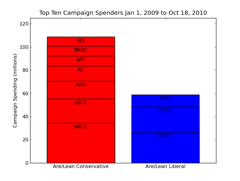
With a pro designer to work this over, the NYTimes could have a sexy front page infographic that’s meaningful, too. Look at that: among the top ten organizations, conservative spending is two times liberal. And if you pull out the “party spenders”, i.e. NRCC, NRSC, DCCC, DSCC, then conservatives are spending five times more. A picture is worth a large number of words, but we should still make them mean something.
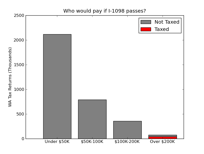
I have another remix to share… actually, this is the one that got me to make some graphs of my own. Seeing misleading areas in print once a week, that I can stand, but when I was reading up on Washington State’s “Tax the Ultra-Rich” ballot initiative and I saw it again this morning… well, you’re reading the results.
Behold Exhibit B:

In this case, there is no pretense that the pyramid slabs mean something about the number of returns that they represent. They’re not even separate slabs, take a look at the top. This pyramid is metaphorical, and it does have a nice color scheme.
But why not make an actual plot? Again, if you get a professional designer to work it over, it can have nice fonts and margins and all, but doesn’t my remix below get the point across better?
Here’s some code if you want to remix my remix.

Exhibit B is stunning, and not in a good way for thestranger.com. Your version in exhibit A is better, too, but ideally I’d like one more box on top of each column, representing the total of all other sources.
I’d love to see that extra box, too. Whatever its size, there would be an interesting story.
It doesn’t make exhibit A more readable, but I think they actually don’t have anything arbitrary:
– All the upper-left corners of the boxes are collinear
– Box area appears to be proportional to the amount of $$ it represents
– Finally, there’s a fixed amount of space along the normal direction between boxes.
So I think they did end up with a systematic, if nigh useless, graphic.