
Hi Abie,
I thought you might be interested in this article that we recently published in the Lancet HIV on “Definitions of Implementation Science in HIV/AIDS.” The full article can be accessed here: http://dx.doi.org/10.1016/S2352-3018(15)00061-2. In this article, we review the use of the term “implementation science” in the HIV scientific literature, then synthesize those existing definitions using network analysis, and finally offer a working definition.
In addition, we used D3 to create an interactive visualization of the network of definitions – available here: http://tinyurl.com/imp-scie-defs-hiv. Hovering over a node reveals the text of the definition; and you can click-and-drag the nodes if any are obscuring author names. Just a few tricks from my days taking your interactive data visualization class 🙂
Thanks for introducing me to interactive data visualization! I very much appreciated your course and I’m happy to have been able to apply your lessons in this article! Hope you’re having a great time with the babies!
Best,
Thomas
Tag Archives: IDV4GH
Cool stuff from an IDV4GH alum
Comments Off on Cool stuff from an IDV4GH alum
Filed under global health
Tables of Stacked Bars in mpl (but not mpld3)
Here is a little feature in Matplotlib that I never saw before: stacked bar plots with tables attached. Perhaps too ugly for my Iraq Mortality stacked bar charts, but definitely handy for exploratory work.
I learned about it because it doesn’t work in `mpld3`… just one more benefit of being part of an open-source project. It would be so cool to have a `mpld3` version with some interactivity included, since interactivity can address one pitfalls of the stacked bar chart, the challenge of comparing lengths with different baselines.
Comments Off on Tables of Stacked Bars in mpl (but not mpld3)
Filed under dataviz
Interactive Horizontal Bar Charts
Some notes on them here: http://nbviewer.ipython.org/gist/aflaxman/c93489dd19cee2eabf00
Comments Off on Interactive Horizontal Bar Charts
Filed under dataviz, software engineering
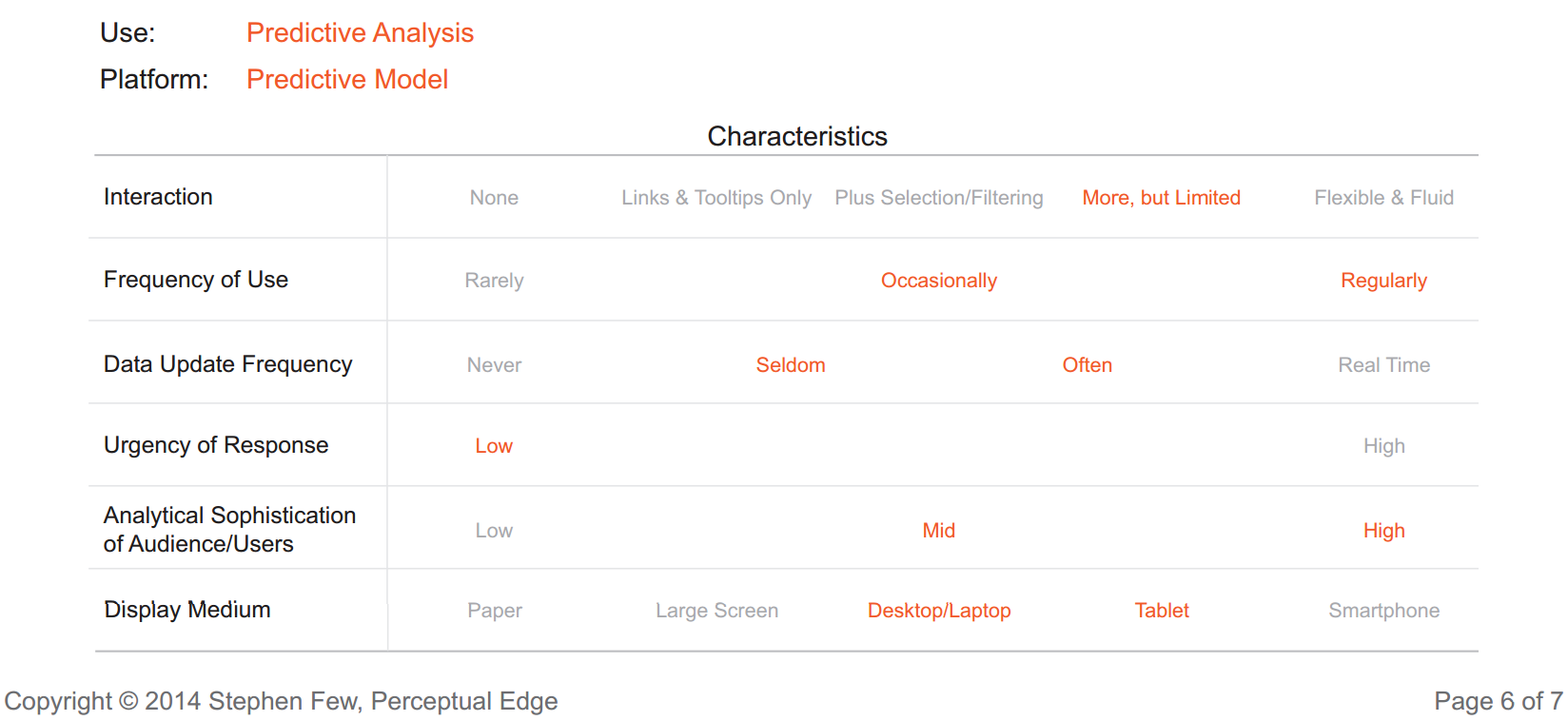
Stephen Few on Display Platforms
A new issue of Stephen Few’s Visual Business Intelligence Newsletter is out. I love categorizing things like this. I have been thinking of interaction very differently than he has, but everything else seems sensible to me.
Comments Off on Stephen Few on Display Platforms
Filed under dataviz
Stylish tooltips in mpld3
I have added some stylish HTML tooltips to mpld3, make something pretty with them. Demonstration here.
Comments Off on Stylish tooltips in mpld3
Filed under dataviz, software engineering
Matplotlib and dj3s, together at last
There is an exciting new project in pythonic interactive data visualization that I have my eye on: mpld3. It plays well with matplotlib-based pretty plotting packages, and has the beginnings of a plugin framework for adding custom interactivity.
I used it to mock up a Cartesian fish eye distortion plot, something I’ve wanted for DisMod-MR ever since I learned about it. (Sometimes the interactivity doesn’t work in that notebook, and requires reloading everything… cutting edge software has some rough edges.)
Filed under dataviz, software engineering
GeoJSON for Norway Counties
This may come in handy: http://gangerolf.blogspot.com/2012/09/norway-in-geojson.html
I know I have seen a nice one for USA somewhere as well.
Comments Off on GeoJSON for Norway Counties
Filed under dataviz
Global Data Viz in translation
IHME has recently worked with the World Bank to release a series of regional reports on relevant findings from the Global Burden of Disease 2010 Study. It is cool to see this work getting disseminated, and now even in non-English editions. This raises questions for data visualization translations, like should 1990 and 2010 be in reversed positions when accompanying right-to-left text?

Comments Off on Global Data Viz in translation
Filed under dataviz
D3js speed
I sometimes wish transitions in a data viz went more smoothly. Maybe this frame-per-second calculator can help with optimization:
Comments Off on D3js speed
Filed under dataviz
IHME data in Economist viz
I had two colleagues call my attention to a cool use of GBD 2010 estimates recently: the Economist observed World Hepatitis Day by calling attention to the deaths due to hepatitis as compared to the deaths due to HIV. It is very nice to see these numbers getting out into the world.
But there are a lot of metrics to use for this comparison, and a lot of ways to show them besides a four-colored map. Find a country of interest from their map, and then make a detailed comparison on the GBD-Compare tool: China, North Africa/Middle East, United States.
Comments Off on IHME data in Economist viz
Filed under global health
