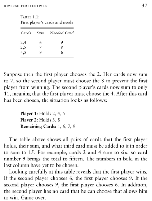
When I was preparing to teach my Fall course, I was concerned about AI cheaters, and whether my lazy approach to getting students to do the reading would be totally outdated. I came up with a “AI statement” for my syllabus that said students can use AI, but they have to tell me how they used it, and they have to take responsibility for the text they turn in, even if they used an AI in the process of generating it.

Now that the fall quarter has come and gone, it seems like a good time to reflect on things. On third of the UW School of Public Health courses last fall had AI statements, with 15 saying “do not use” and 30 saying use in some way (such as “use with permission”, or “use with disclosure”).
In hindsight, AI cheating was not the thing I should have been worrying about. Here are five areas of concern that I learned about from my students and colleagues that I will be paying more attention to next time around:
1. Access and equity – there is a risk with the “pay to play” state of the technology right now. How shall we guard against a new digital divide between those who have access to state-of-the-art AI and those who do not? IHME has ChatGPT-4 for all staff, but only the Health Metrics Sciences students who have IHME Research Assistantship can use it. As far as I can tell, the Epi Department students all have to buy access. From what I can tell, the University of Michigan is solving this, are other schools?

“When I speak in front of groups and ask them to raise their hands if they used the free version of ChatGPT, almost every hand goes up. When I ask the same group how many use GPT-4, almost no one raises their hand. I increasingly think the decision of OpenAI to make the “bad” AI free is causing people to miss why AI seems like such a huge deal to a minority of people that use advanced systems and elicits a shrug from everyone else.” —Ethan Mollick
2. Interfering with the “novice-to-expert” progression – will we no longer have expert disease modelers, because novice disease modelers who rely on AI do not progress beyond novice level modeling?
3. Environmental impact – what does running a language model cost in terms of energy consumption? Is it worth the impact?
4. Implicit bias – language models repeat and reinforce systems of oppression present in training data. How can we guard against this harming society?

5. Privacy and confidentiality – everything we type into an online system might be used as “training data” for future systems. What are the risks of this practice, and how can we act responsibly?