
https://plot.ly/dash/
https://community.plot.ly/c/dash
https://github.com/plotly/dash
https://plot.ly/dash/getting-started
View at Medium.com
Tag Archives: dataviz
One more IDV in Python approach
Comments Off on One more IDV in Python approach
Filed under Uncategorized
Its 2018, how to IDV in Python?
I’ve got a fun little viz that I need to demo for Important People (IP) in early March [editor’s note: still not done… that deadline was highly optimistic!]. How to do it?
In Python? Sure. In a Jupyter notebook? Maybe. With Matplotlib? Probably not… at least I better have a look at the state of the alternatives.
Did I mention that it is essential for this viz to be *interactive*? It needs to allow the Important People to explore the predictions of some ML model, or at least allow me to explore them while they call out how to explore.
Years ago, I attempted to designate a particular plot the “hello, world” of data viz. Remember that? I think we should extend it to a hello world of interactive data viz. Maybe just choosing the number of digits is enough. Or should it follow the visual information seeking mantra? But “hello, world” cannot be too complicated.
yhat?
Altair
https://altair-viz.github.io
https://github.com/altair-viz/altair_widgets/blob/master/examples/Iris.ipynb
http://pbpython.com/altair-intro.html
Bokeh
https://bokeh.pydata.org/en/latest/docs/gallery.html#gallery
Click to access Python_Bokeh_Cheat_Sheet.pdf
https://www.datacamp.com/courses/interactive-data-visualization-with-bokeh/
https://www.datacamp.com/community/blog/bokeh-cheat-sheet-python
https://demo.bokehplots.com/apps/movies
A Dramatic Tour through Python’s Data Visualization Landscape (including ggplot and Altair)
Comments Off on Its 2018, how to IDV in Python?
Filed under Uncategorized
eScience Talk: Zan Armstrong
I missed it but the recording is high quality: https://www.youtube.com/watch?v=p8EtCUyLxIE
Comments Off on eScience Talk: Zan Armstrong
Filed under Uncategorized
Dataviz in Python: Stephen Few’s new jittering
I am always excited to get news of a new Visual Business Intelligence Newsletter in my Inbox, and that is what arrived at the end of last week. This time Few takes on “jittering”, and suggests an interesting alternative to adding random noise.

Here is a little python snippet to do it:
def wheat_plot(x):
    hist, bin_edges = np.histogram(x)

    # make y position based on values of hist
    y = []
    for h_i in hist:
        y += range(h_i)

    plt.plot(sorted(x), y, 'o')
    plt.yticks([])
Here is a notebook that makes that code do something: https://gist.github.com/aflaxman/235f94f9563b1675233d6d35cd30b8c2
Also Jeff Heer and company made an interactive version in Vega: https://vega.github.io/vega/examples/wheat-plot/
Comments Off on Dataviz in Python: Stephen Few’s new jittering
Filed under Uncategorized
Ideas that did not make it into my recent Data Viz talk
D3js in any substantial way
Steve Few email list, and his example with isotype and patient risk charts
538.com viz stuff
Comments Off on Ideas that did not make it into my recent Data Viz talk
Filed under dataviz
Robust Misunderstanding of Statistics
Interesting paper: http://www.ejwagenmakers.com/inpress/HoekstraEtAlPBR.pdf
Here is the quiz they used:
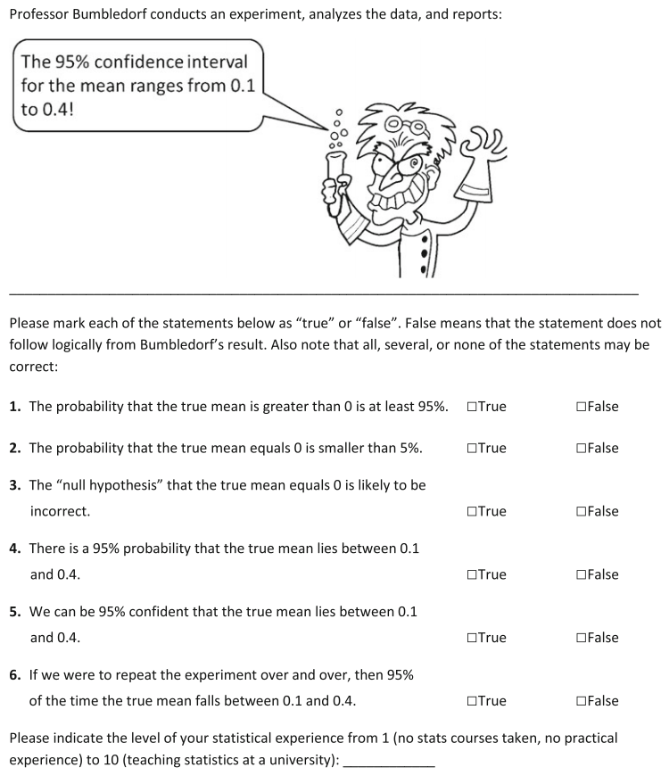
I’d love to replicate for a few of the target audiences for my work.
Filed under statistics
Beyond the Sum-Difference Plot
Bland–Altman plot
From Wikipedia, the free encyclopedia
Bland–Altman plot example
A Bland–Altman plot (Difference plot) in analytical chemistry and biostatistics is a method of data plotting used in analyzing the agreement between two different assays. It is identical to a Tukey mean-difference plot, the name by which it is known in other fields, but was popularised in medical statistics by J. Martin Bland and Douglas G. Altman.[1][2]
SciPy2014 Plotting Contest
I helped judge a plotting contest for the Scientific Python conference last summer. Who won? I don’t know, and a short web searching binge didn’t find out. A lovely plot took 3rd place, and every entry is here (with sourcecode). Good stuff for seeing how different groups do different tricks, and for checking what still doesn’t work in mpld3.
Comments Off on SciPy2014 Plotting Contest
Filed under dataviz
