Monthly Archives: September 2013

IHME Seminar: Ambient Air Pollution and Cardiovascular Disease

The semester is starting up again, and that means that weekly IHME seminars are starting up again. This week, we heard from Joel Kaufman, a doctor and UW professor who knows quite a lot about how air pollution is bad for the heart. He had some great historical photos of air pollution from the Great Smog of London, which I had not heard of before. Searching later led me to this collection in the Guardian. Dr. Kaufman also had some recent photos of extreme air pollution, which looked sort of like this one.

I remember when I started this blog, I had a goal to draw connections between the issues in global health and the methods and results of theoretical computer science. What does the air-pollution/cardio-health talk inspire along these lines? Well, there are two “big data” sources going on here: continuously updated measurements of air quality from a number of geographically dispersed sensors, and regularly conducted CT scans of participants in a large longitudinal study. It was only an hour long talk, so I’m not sure what problems arise when you put these things together, but I bet you can’t store it all in memory, even on a pretty large computer. And that’s one definition of big…

Comments Off on IHME Seminar: Ambient Air Pollution and Cardiovascular Disease

Filed under Uncategorized

Comparing spline models

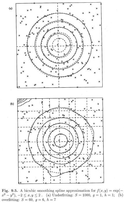
I need a graphic for dismod that makes the point as nicely as this one:

smooth_splines

It’s from P. Dierckx, Curve and Surface Fitting with Splines, which also has some pretty pictures of bivariate splines doing their thing:

bisplines

Comments Off on Comparing spline models

Filed under machine learning

Will I attend a MOOC?

The author of one of the best books on data visualization is giving a massively open online course (MOOC) this fall. I’m going to check it out. You may be interested, too.

http://www.thefunctionalart.com/2013/09/the-third-introduction-to-infographics.html

Comments Off on Will I attend a MOOC?

Filed under dataviz, education

GeoJSON for Norway Counties

This may come in handy: http://gangerolf.blogspot.com/2012/09/norway-in-geojson.html

I know I have seen a nice one for USA somewhere as well.

Comments Off on GeoJSON for Norway Counties

Filed under dataviz

PyMC3 coming along

I have been watching the development of PyMC3 from a distance for some time now, and finally have had a chance to play around with it myself. It is coming along quite nicely! Here is a notebook Kyle posted to the mailing list recently which has a clean demonstration of using Normal and Laplace likelihoods in linear regression: http://nbviewer.ipython.org/c212194ecbd2ee050192/variable_selection.ipynb

Comments Off on PyMC3 coming along

Filed under statistics

Global Data Viz in translation

IHME has recently worked with the World Bank to release a series of regional reports on relevant findings from the Global Burden of Disease 2010 Study. It is cool to see this work getting disseminated, and now even in non-English editions. This raises questions for data visualization translations, like should 1990 and 2010 be in reversed positions when accompanying right-to-left text?

gh_dv_q

Comments Off on Global Data Viz in translation

Filed under dataviz

Thoughtful blog about using IPython Notebook in scientific workflow

Here: http://www.pgbovine.net/ipython-notebook-first-impressions.htm

I’ve been doing this for about a year now, and it is working super-well. What I wish for is a way to paste images directly into the notebook. I think it would be pretty easy to add but I haven’t figured out how to do it yet.

Comments Off on Thoughtful blog about using IPython Notebook in scientific workflow

Filed under Uncategorized