
I started reading an “economics of diversity” book recently, and stumbled across a great example of the power of visual analytics (included early in the book to demonstrate the value of diverse representations):
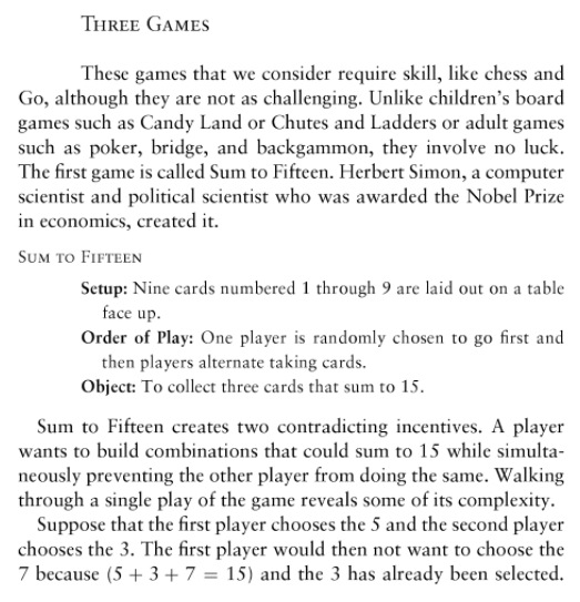
This game is hard, right? I mean I have to think about it to figure out a good move. But if you think of it visually, the right way, it is not hard. I’ll leave it as a mystery for now, and say that I can imagine a classroom exercise on this when I next teach interactive data visualization again.
