
OMG I have got busy. I went to NIPS and the weekend disappeared and now it’s post-doc interview season again, already! So much to say, but I plan to pace myself. For this short post, an exciting announcement that my model of the insecticide treated mosquito net distribution supply chain was used in the WHO 2010 World Malaria Report, which just came out. Since it is a Bayesian statistical model that draws samples from a posterior distribution with MCMC, it’s really nice that the report includes some of the uncertainty intervals around the coverage estimates. Guess what? There is a lot of uncertainty. But nets are getting to households and getting used. Pages 19 and 20 in Chapter 4 have the results of our hard work.
MCMC in Python: Statistical model stuck on a stochastic system dynamics model in PyMC
My recent tutorial on how to stick a statistical model on a systems dynamics model in PyMC generated a good amount of reader interest, as well as an interesting comment from Anand Patil, who writes:
Something that might interest you is that, in continuous-time stochastic differential equation models, handling the unobserved sample path between observations is really tricky. Roberts and Stramer’s On inference for partially observed nonlinear diffusion models using the Metropolis-Hastings algorithm explains why. This difficulty can apply to discrete-time models with loads of missing data as well. Alexandros Beskos has produced several really cool solutions.
This body of research is quite far from the vocabulary I am familiar with, so I’m not sure how serious a problem this could be for me. It did get me interested in sticking my statistical model to a systems model with stochastic dynamics, though, something which took only a few additional lines… thanks PyMC!
## Stochastic SI model

from pymc import *
from numpy import *

#observed data
T = 10
susceptible_data = array([999,997,996,994,993,992,990,989,986,984])
infected_data = array([1,2,5,6,7,18,19,21,23,25])

# stochastic priors
beta = Uniform('beta', 0., 1., value=.05)
gamma = Uniform('gamma', 0., 1., value=.001)
tau = Normal('tau', mu=.01, tau=100., value=.01)

# stochastic compartmental model
S = {}
I = {}

## uninformative initial conditions
S[0] = Uninformative('S_0', value=999.)
I[0] = Uninformative('I_0', value=1.)

## stochastic difference equations for later times
for i in range(1,T):
    @deterministic(name='E[S_%d]'%i)
    def E_S_i(S=S[i-1], I=I[i-1], beta=beta):
        return S - beta * S * I / (S + I)
    S[i] = Normal('S_%d'%i, mu=E_S_i, tau=tau, value=E_S_i.value)

    @deterministic(name='E[I_%d]'%i)
    def E_I_i(S=S[i-1], I=I[i-1], beta=beta, gamma=gamma):
        return I + beta * S * I / (S + I) - gamma * I
    I[i] = Normal('I_%d'%i, mu=E_I_i, tau=tau, value=E_I_i.value)

# data likelihood
A = Poisson('A', mu=[S[i] for i in range(T)], value=susceptible_data, observed=True)
B = Poisson('B', mu=[I[i] for i in range(T)], value=infected_data, observed=True)
This ends up taking a total of 6 lines more than the deterministic version, and all the substantial changes are from lines 24-34. So, question one is for Anand, do I have to worry about unobserved sample paths here? If I’ve understood Roberts and Stramer’s introduction, I should be ok. Question two returns to a blog topic from one year ago, that I’ve continued to try to educate myself about: how do I decide if and when this more complicated model should be used?
Comments Off on MCMC in Python: Statistical model stuck on a stochastic system dynamics model in PyMC
Filed under global health, MCMC, statistics
Snowed in Seattle
Since Seattle rarely sees snow the city gets quite shut down when it does happen. We have a few inches on the ground today, so despite the beautiful sun, UW has suspended operations. Fine for me, I like the change of scenery. Somehow, these snowy days have got me watching a lot of online videos. First of all, a movie recommendation: In the loop, a political satire, which is the genre that Jessi and I agree on the most.
But for those of you looking for a shorter diversion and/or something healthyalgorithms related, I call your attention first to Google Refine Screencasts and second to a list of the 20 must-see CS TED talks from the mastersincomputerscience blog.
On the 20 must-see list, Torsten Reil’s talk caught my eye. He has built these human models with really lifelike kinetics using serious physics and biology, and then has 15 minutes of his talk devoted to showing what happens when he pushes them around. My caricature of a hard-AI researcher is a mad scientist building a sentient computer to be their only friend, so the way Reil has created these lifelike virtual people just to beat the up and make fun of their dance moves, that exceeds my expectations.
Beautiful Networks
I’ve had a secret project running in the background this week two weeks ago (how time flies!), a continuation of my work on bias reduction for traceroute sampling. It would be nice if this had applications to global health, but unfortunately (and uncharacteristically) I can’t think of any. It is a great opportunity for visualizing networks, though, a topic worthy of a quick post.
The bowl-of-spaghetti network visualization has been a staple of complex networks research for the last decade. I’m not convinced that there is anything interesting to learn from real world networks by drawing them in 2 or 3 dimensions, but the graphics a seriously eye catching. And I’m not convinced that there isn’t anything to learn from them, either. I invite you to convince me in the comments.

Interesting?
What my side project has reminded me of, however, is the value of drawing networks in 2 dimensions for illustrating the principles of network algorithms and network statistics. And if the topic of study is complex or real-world or random networks, than a little bit of spaghetti in the graphic seems appropriate.
There are a lot of nice tools for doing this now, and just collecting the things I should consider in one place makes this post worthwhile for me. I learn towards a Pythonic solution of networkx driving graphviz, but there are some javascript options out there now that seem promising (jit, protovis, possibly more from a stackoverflow question) in. And for those looking for a less command-line-based solution, the Pajek system seems like a good route.
As for what to graph, here are my thoughts. The Erdos-Renyi graph doesn’t look good, and the Preferential Attachment graph doesn’t look good. Use them for your theorems and for your simulations, but when it comes time to draw something, consider a random geometric graph. And since these can be a little dense, you might want an “edge-percolated random geometric graph”.
I did have a little trouble with this approach, too, when I was drawing minimum spanning trees, because the random geometric points end up being placed really close together occasionally. So maybe the absolutely best random graph for illustrations would be a geometric graph with vertices from a “hard core” model, which is to say random conditioned on being a minimum distance apart. Unfortunately, it is an open question how to efficiently generate hard-core points. But it’s not hard to fake:

More informative?
Want some of your own? Here’s the code.
Comments Off on Beautiful Networks
Filed under probability
OR jobs (oh, are they?)
Jason Hartlines writes to publicize the Northwestern University Industrial Engineering department’s search to fill two faculty positions. Individuals with interest in logistics and health-care operations (as well as a range of other interests) are especially encouraged to apply.
Comments Off on OR jobs (oh, are they?)
Filed under Uncategorized
Nice post on Cython
Python/Sage guru William Stein has a nice article about Cython and how it can speed up routine calculations at the expense of mathematical elegance (and why that is a good thing). Could Sage be my interactive shell for PyMC modeling?
Comments Off on Nice post on Cython
Filed under software engineering
Interesting Talks
Here are a slew of interesting things for computer scientists interested in global health, from the UW CSE Industrial Affiliates Program. This came my from the UW Change mailing list.
Comments Off on Interesting Talks
Filed under global health
Global Health Metrics and Evaluation (GHME) Conference 2011
The Global Health Metrics and Evaluation (GHME) Conference 2011 is something that might interest you. It’s in Seattle, from March 14-16, 2011. More from the conference website:
The Global Health Metrics & Evaluation (GHME) conference aims to bring together all the different disciplines involved in global health measurement and evaluation under one roof to share innovative tools and methods to get a better understanding of what the possibilities are in approaching population health measurement.
Who should come? People who are interested in cutting edge science, who want to learn from others in their fields and in other fields. Specifically, researchers, academic leaders, students, policymakers, non-governmental organizations, foundations, country offices of health statistics, and national and multi-national health organizations.
Comments Off on Global Health Metrics and Evaluation (GHME) Conference 2011
Filed under global health
Speaking of graphics…
I got this email the other day:
the open data kit team is in dire need of a logo and we need your help. if you know a designer (or are a designer) looking to contribute to a growing open source project, now is your chance!
before you get started, we have three rules.
- go big! although the core team works on healthcare in africa, odk is a much broader project. try to stay away from global development or health themes, but feel free to play off the words and ideas in the project name.
- think unified! we build a lot of tools (collect, aggregate, build, voice, clinic, etc), so a brand that could be used across all of them would be great. for example, most of the adobe creative suite applications use the same basic theme. see them at http://goo.gl/1HYP.
- be inspired! if you’ve never designed a logo, http://goo.gl/2KBy has some great ideas to help you get started. that site also has links to an amazing array of examples.
our goal is to have a couple of logos that we can pick from, so spread the word and send in a few! the deadline for the competition is november 1 at midnight. send your attempts to yano…@gmail.com.
thanks for helping make odk a more visually pleasing project,
yaw
Comments Off on Speaking of graphics…
Filed under global health
Election Season Infographics
I’ve seen a lot of visual display of quantitative information in the news lately, and I like that. But I’ve seen a lot of ink used for more style than substance, and that bugs me, especially when the point is stronger with more substance.
In Exhibit A, I draw your attention to the graphic from last week’s NYTimes front page article Top Corporations Aid U.S. Chamber of Commerce Campaign. The graphic on the web differs slightly from online, but both obscure the point: conservative groups are drastically outspending their rivals in the current election cycle.

A casual observer might miss this though, because of the stylish way the data is represented as red and blue squares, each standing on edge. The artfully arbitrary spacing between the overlapping squares makes it even harder to interpret.
Here’s my remix:
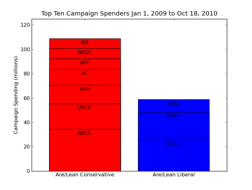
With a pro designer to work this over, the NYTimes could have a sexy front page infographic that’s meaningful, too. Look at that: among the top ten organizations, conservative spending is two times liberal. And if you pull out the “party spenders”, i.e. NRCC, NRSC, DCCC, DSCC, then conservatives are spending five times more. A picture is worth a large number of words, but we should still make them mean something.
I have another remix to share… actually, this is the one that got me to make some graphs of my own. Seeing misleading areas in print once a week, that I can stand, but when I was reading up on Washington State’s “Tax the Ultra-Rich” ballot initiative and I saw it again this morning… well, you’re reading the results.
Behold Exhibit B:

In this case, there is no pretense that the pyramid slabs mean something about the number of returns that they represent. They’re not even separate slabs, take a look at the top. This pyramid is metaphorical, and it does have a nice color scheme.
But why not make an actual plot? Again, if you get a professional designer to work it over, it can have nice fonts and margins and all, but doesn’t my remix below get the point across better?
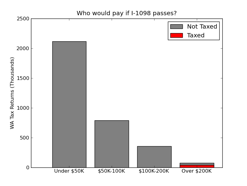
Here’s some code if you want to remix my remix.
Filed under statistics
